The research exposed a clear utilisation gap:
The rating feature has been clicked only 163 times in total. 152 of those clicks are warnings, not endorsements. While just five Conversations exist across the entire catalog, three of which are unanswered questions . Interviews confirmed that people “keep code in personal folders” and “switch to Teams when they need help,” signalling low confidence in Alation’s social tools . In short, the UI neither highlights community value nor rewards contributors, leaving potentially useful scripts and tribal knowledge hidden from view.
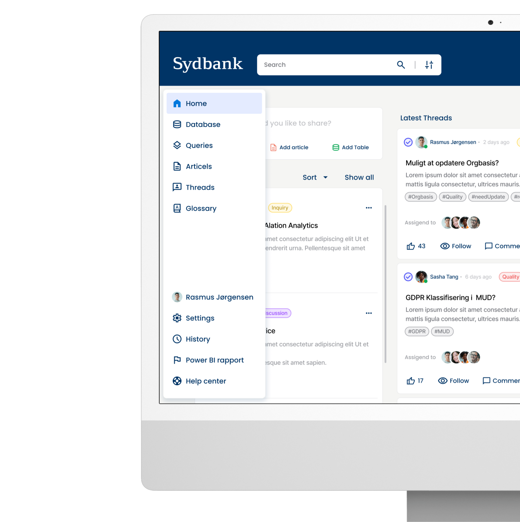
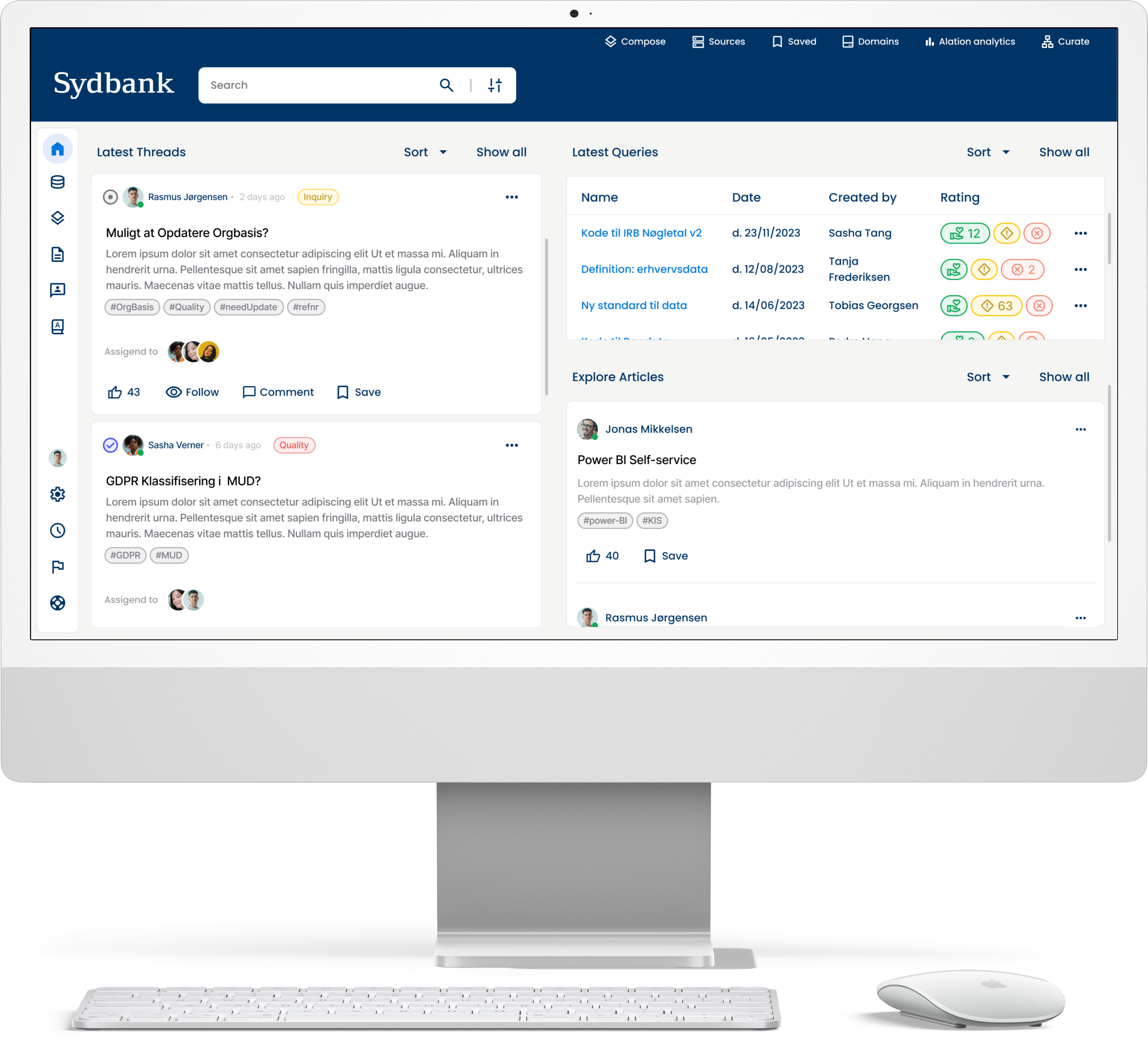
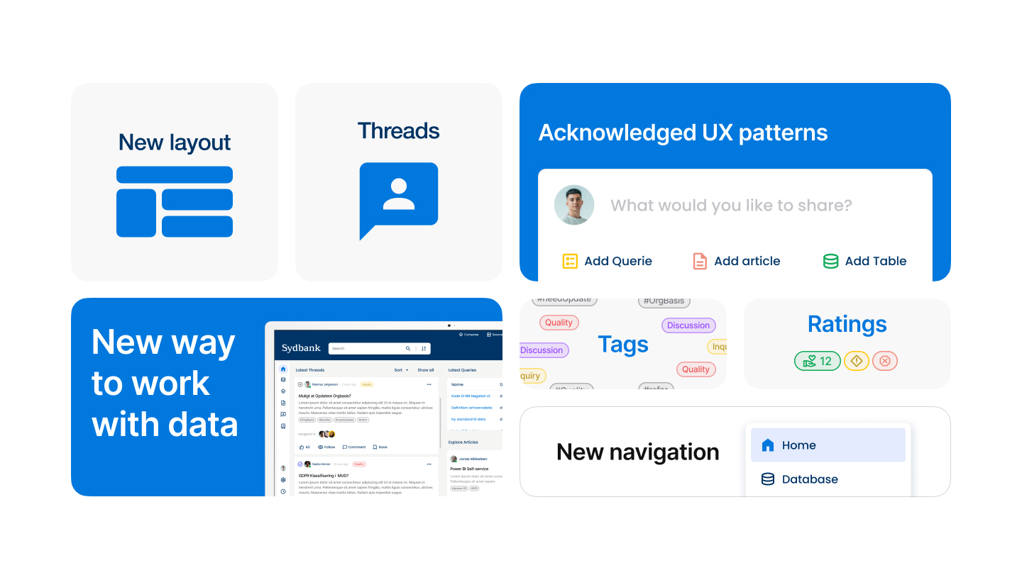
We designed a high-fidelity Figma prototype that layers targeted community features onto familiar workflows
Threads: a tag-driven, Slack-style discussion panel anchored to every table, query and article, letting users ask follow-up questions and mark answers as “Accepted” for future seekers.
Curated Home Dashboard: widgets for Latest Threads, Popular Queries and Featured Articles surface active content the moment users log in, replacing the static catalog landing page.
Clarified Rating UI: iconography shifts from ambiguous flags to positive/negative thumbs, colour-safe states and an inline tooltip explaining impact.
Undo Toasts & Micro-animation: real-time feedback encourages experimentation while staying WCAG-AA compliant. Prototype flows were validated through unmoderated remote tests in Maze; heat-maps and task-completion logs guided micro-interaction refinements.