UX Design Internship at Vipps MobilePay

Overview
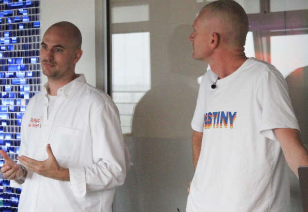
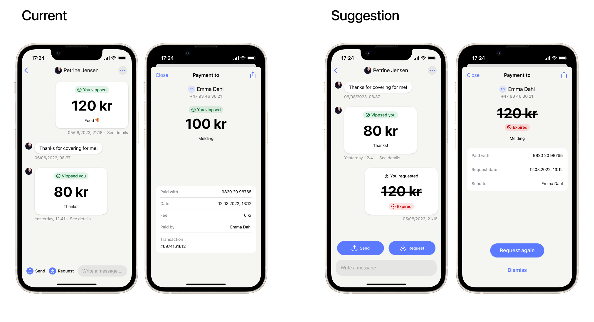
During my UX design internship at MobilePay (August–October 2024), I worked as part of the product design team at Vipps MobilePay, contributing to the development and evaluation of new and existing features in one of Scandinavia’s most widely used financial apps.
My Contributions
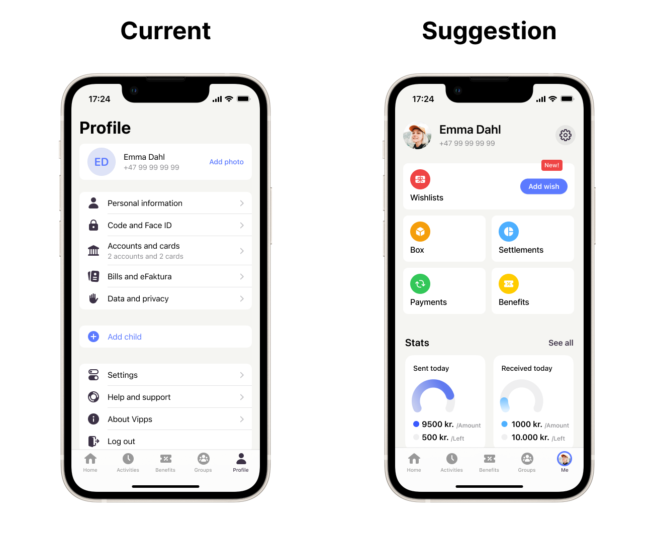
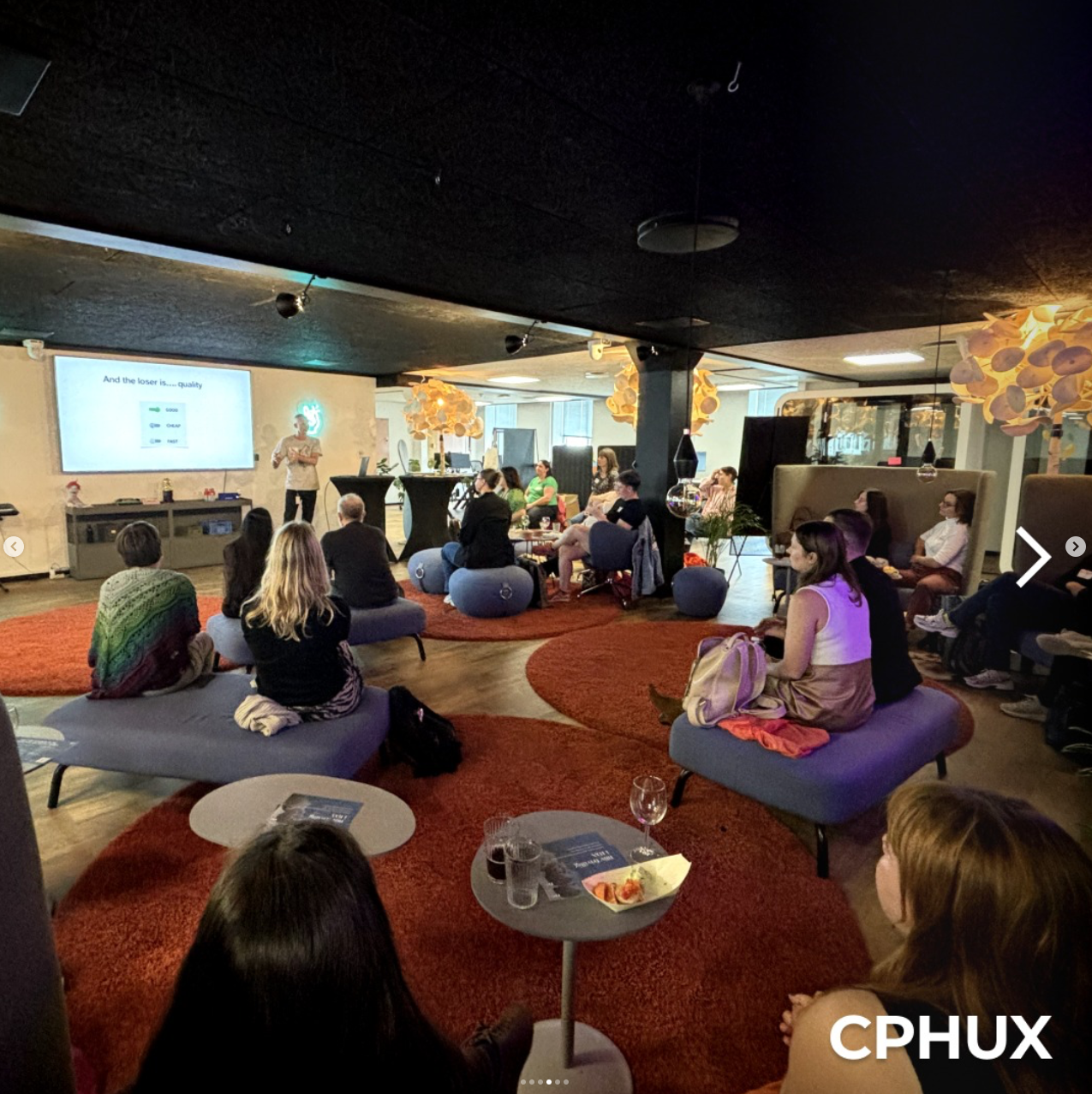
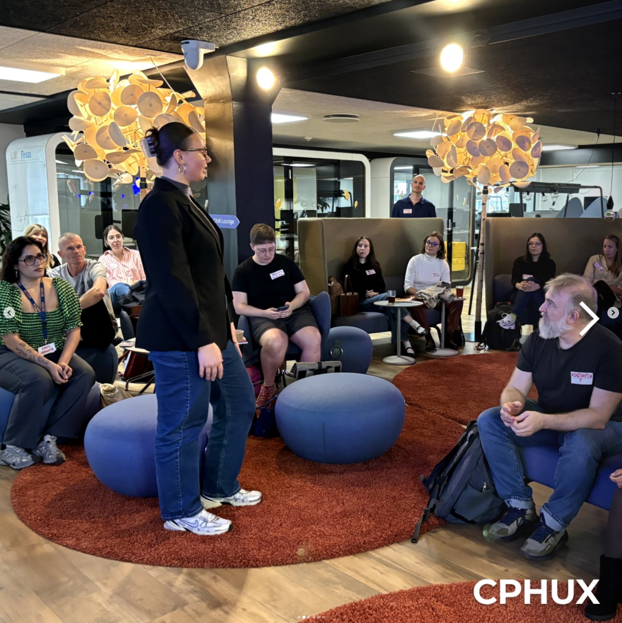
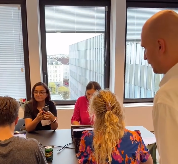
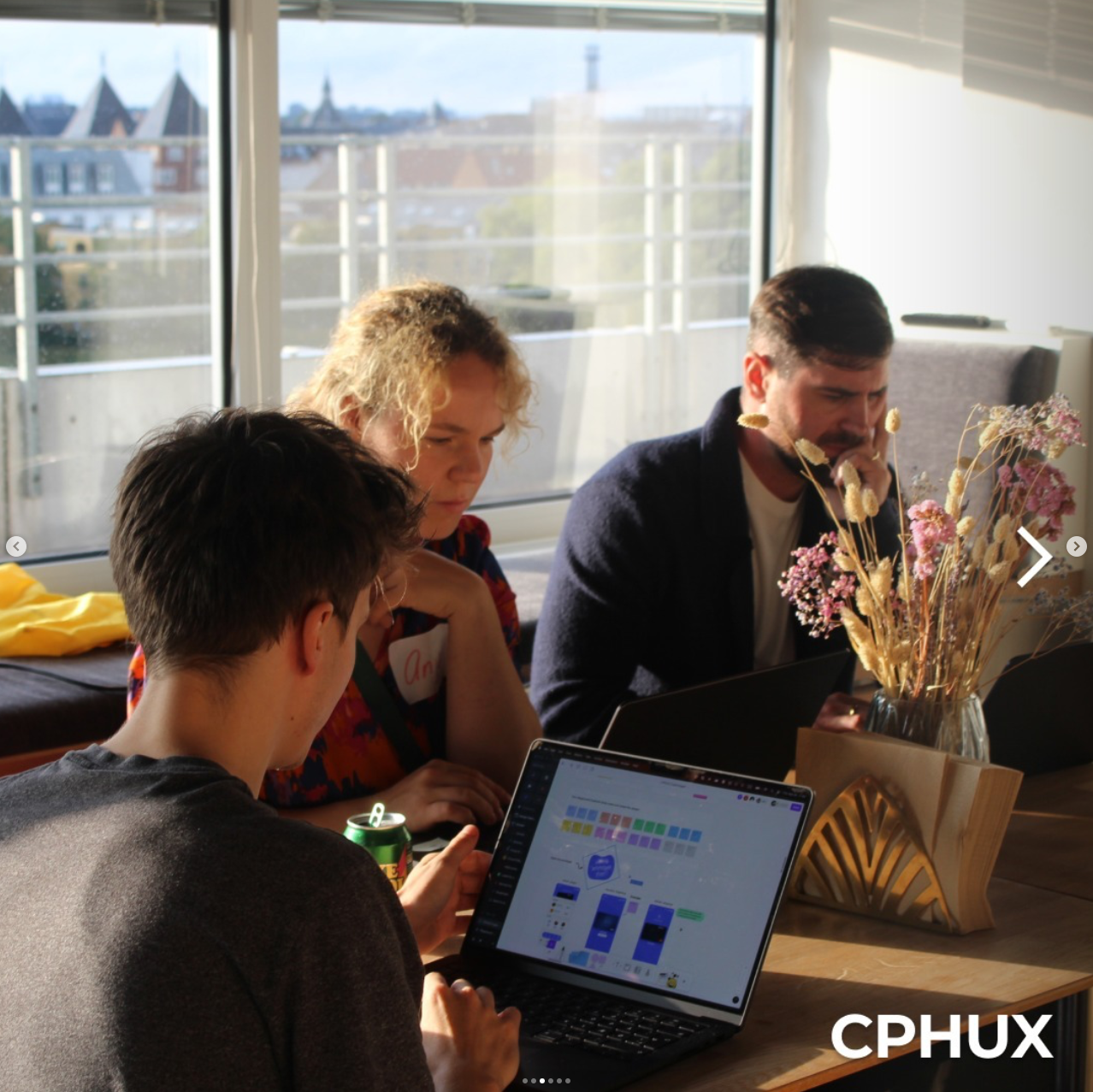
My role centered on identifying usability gaps, improving user flows, and supporting the integration of new features while maintaining a high standard of user experience. I was given the opportunity to independently lead research and design tasks, collaborate across disciplines, and work with real users through structured testing and workshops.

The following cases reflect my contributions to MobilePay’s ongoing development efforts and showcase how I translated design theory into practical, high-impact UX work.
Redesigned the app’s profile page to act as a customizable “Me” page for secondary features not supported by the current navigation elements.

Created multiple wireframes and high-fidelity prototypes to explore how additional features could be integrated without reducing usability.

Introduced personalization options, allowing users to control which features are shown on their profile.
🔍 Improving Navigation and User Flow in MobilePay
New Profile Page Structure
Co-organized and facilitated UX workshops in Aarhus and Copenhagen focused on evaluating the upcoming “Tap and Go” feature.

Used heuristic expert evaluation methods with categories like Usability, Discoverability, Value, Aesthetics, and Design.

Designed the FigJam environment and interactive Figma prototype used in the workshop sessions.

Collected and synthesized feedback from groups of UX professionals and students.

Strengthened my facilitation, analysis, and communication skills in both digital and in-person settings.
📱 Facilitating and Evaluating Functionality: “Tap and Go”
🛠️ General UX Improvements
New search page
🛁 Full page header to clean up the view.
🔎 Sections for each result type for easy distinguishment.
👌 Better reachability for the search bar.
📸 Added QR Scanner in the search bar due to feedback from users.
🫣 Keyboard hides as default as insights show that users select people from the list more often than typing.
Introducing the “Re-request” function
♻️ Designed a feature allowing users to resend expired payment requests with one tap.
🛟 Identified a gap in functionality based on personal experience.
Currency conversion warnings in “Groups”
✈️ Designed clear communication for scenarios where users from different countries share expenses, ensuring visibility of exchange rate and fee information.