01 — Sydbank · 2024
Enhancing the UX of data governance
A Master's research project reimagining how a bank shares and trusts its data — where I led the prototype and usability testing.
UX ResearchData GovernanceFigmaPrototyping
01 — Sydbank · 2024
A Master's research project reimagining how a bank shares and trusts its data — where I led the prototype and usability testing.
Introduction
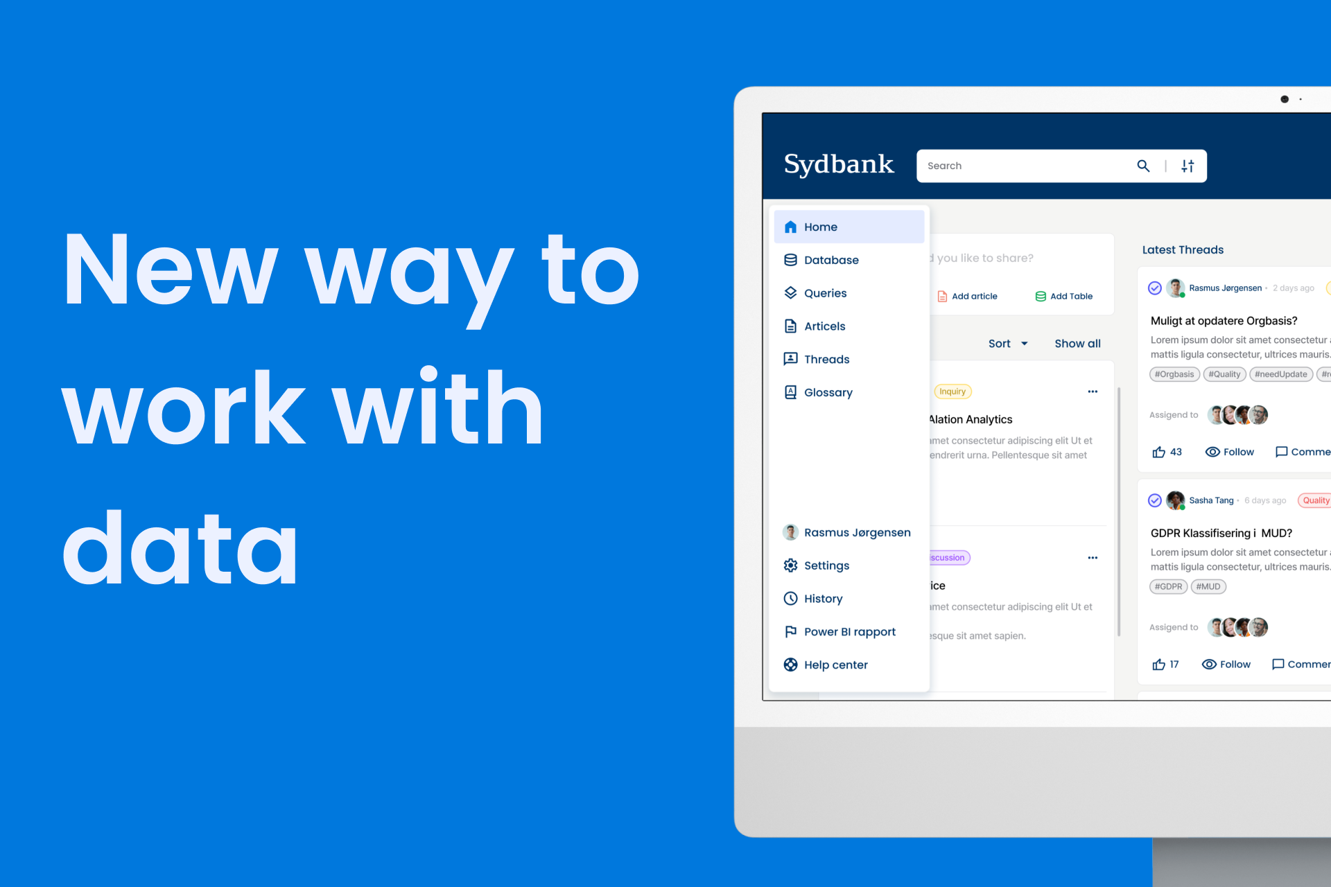
Sydbank's Alation catalog stores thousands of tables, queries and articles — yet employees still solve everyday data questions over Teams, email and hallway chats. That siloed habit buries good work and slows new analysts. In a team of four at SDU, I led Study 3: the high-fidelity prototype and the usability test with real Alation users.
Research question
How might we improve Alation's community features so the catalog actively drives knowledge-sharing between its users?
Research method
A mixed-methods approach where each study built on the last — so decisions stayed grounded in real behaviour, not assumptions.
Re-analysed Sydbank's internal interviews: ratings, conversations and queries were useful in principle but overlooked in practice.
Netnographic review plus an expert pass against Nielsen's 10 heuristics — confirming near-zero community activity and the UI issues behind it.
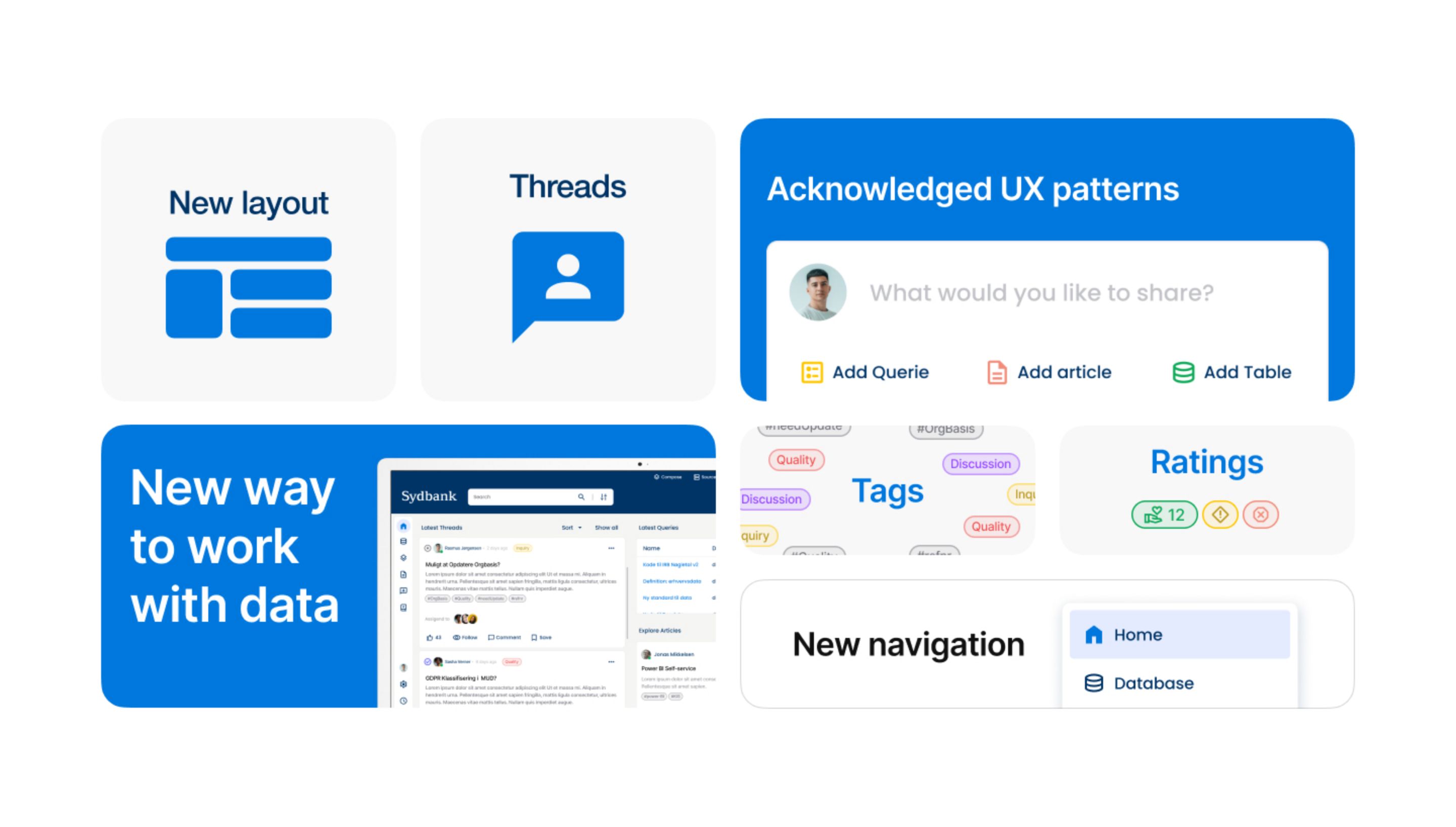
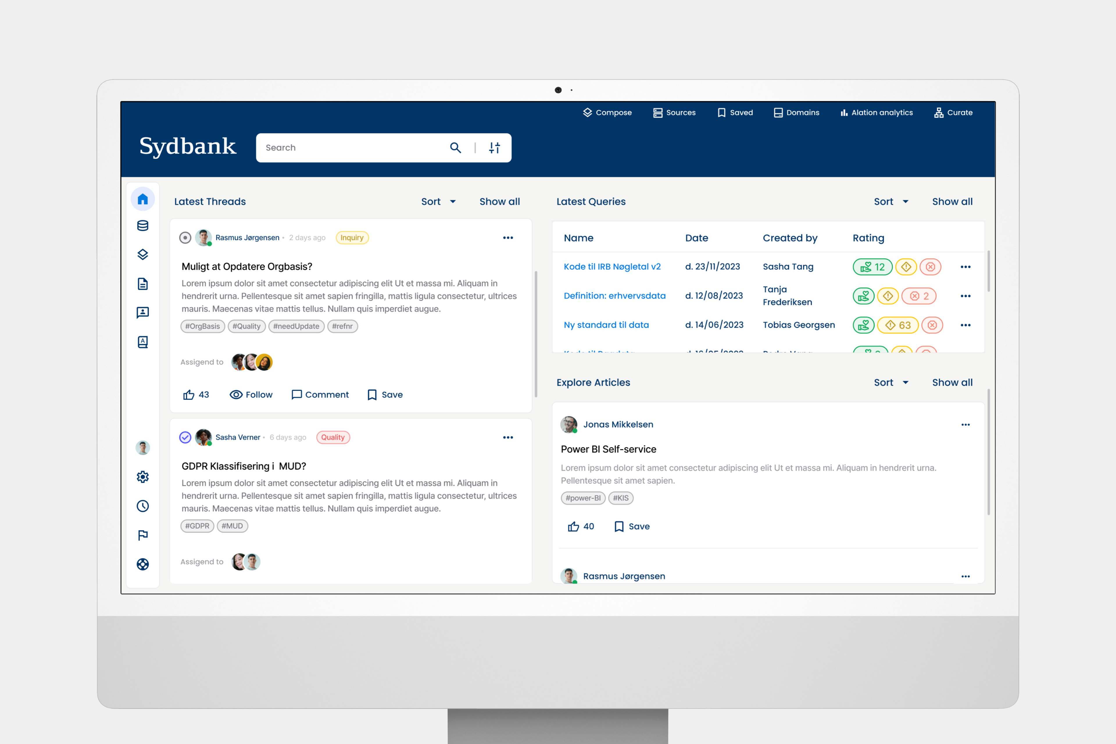
Built the high-fidelity Figma prototype — Threads, a redesigned dashboard, clearer states — and tested it unmoderated in Maze.
Triangulated Maze behaviour (heat-maps, completion, time-on-task) with qualitative email responses, coded in NVivo.
Framed it all through Wenger's Communities of Practice — UI alone can't manufacture a culture of sharing.
Results
Key features
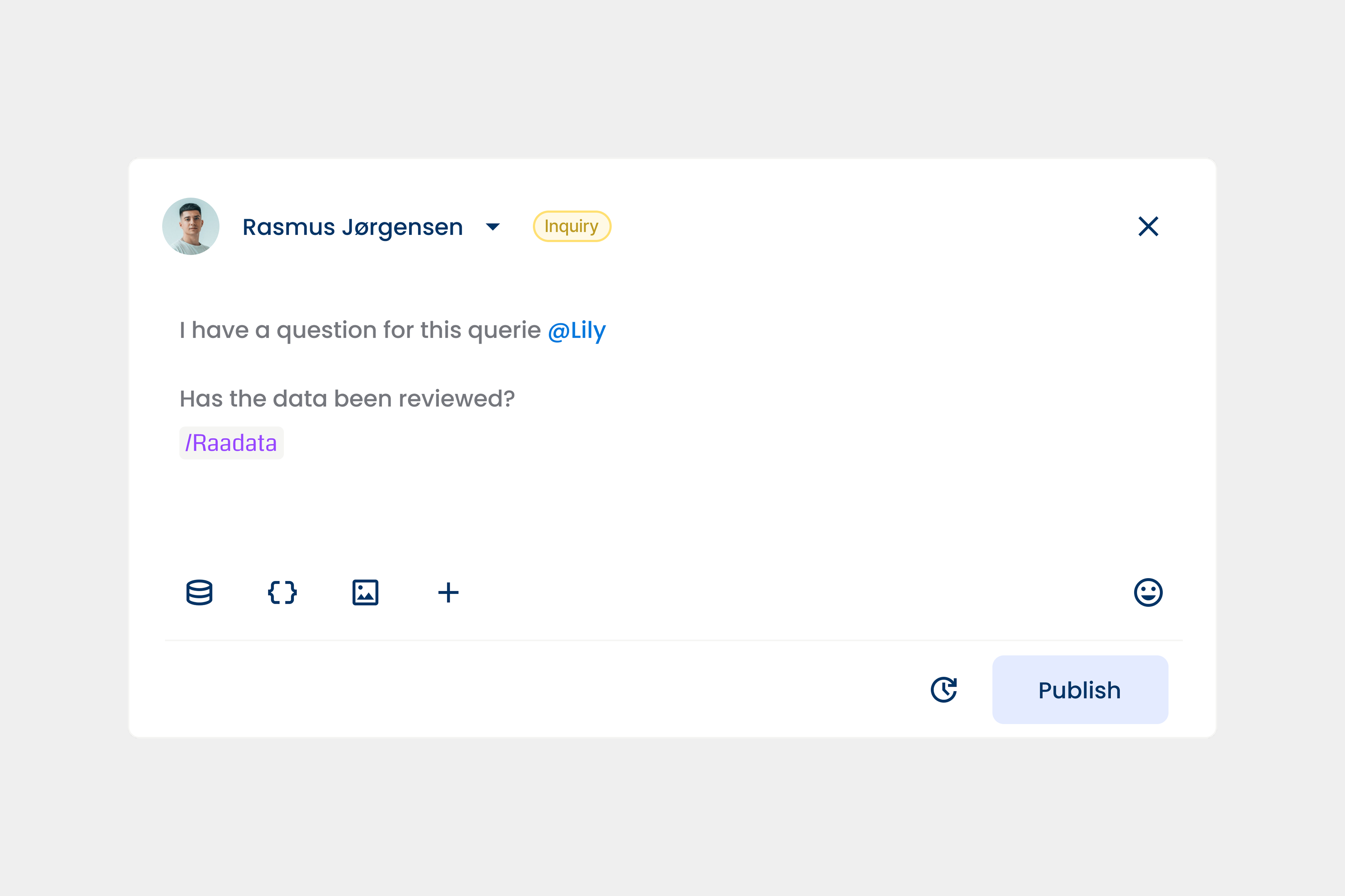
A high-fidelity prototype layering community features onto familiar workflows.
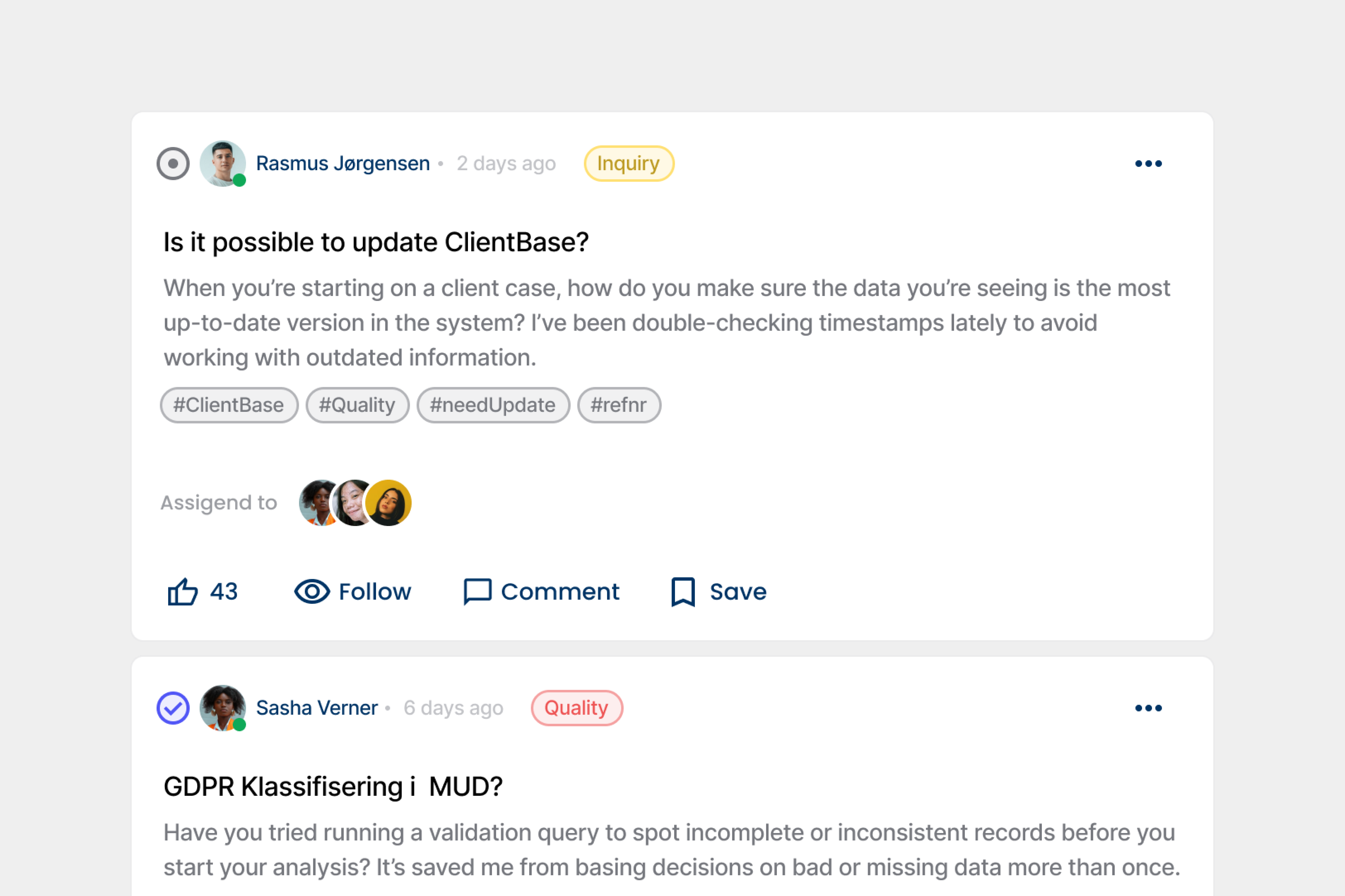
A tag-driven discussion anchored to every table, query and article. Questions get asked in context and answers marked “Accepted” — so the next person finds a trusted resolution.
Latest Threads, Popular Queries and Featured Articles surface active content at login, replacing the static landing page with a living overview.
Ambiguous flags become clear positive / negative thumbs with colour-safe states and a tooltip explaining each rating's impact.
Real-time feedback makes actions reversible and the UI feel tactile — WCAG-AA throughout.
Grounded in
“It's not just ‘empty’ when I open it — I can see my colleagues are active, and I keep up with what Alation can do.”
Reflection
The honest read: usability improved, but a single prototype can't create a community of practice on its own.